The “Data Integrity Group” and its Claims of Election Fraud Debunked
When a relative of mine cited this video by The Epoch Times as evidence that the 2020 presidential election was potentially ‘rigged’, I decided to see if its claims were any more compelling than the many brands of hearsay that had comprised most conspiratorial claims thus far. The video features testimony by four members of ‘The Data Integrity Group’, an organization that was supposedly formed by a group of data scientists that noticed “very strange behavior” in reported vote counts for Donald Trump and Joe Biden on election night and in the days that followed. Having apparently analyzed these running vote totals in every state, the group claims to have found “irregularities” in over 30 states, though this video focuses primarily on Pennsylvania and Georgia.
What sets claims made in this video apart from speculative anecdotes of vote manipulation is the fact that their evidence is purportedly based on unbiased, publicly available datasets, and should, therefore, be reproducible. In fact one of the group’s data scientists implores viewers:
“I would love to hear it [a refutation of their claims], if you could, you know and that’s the thing, when we release these videos, we put out the dataset, this is what we use, see what you can come up with, right? If you can come up with something and an explanation for what we’re seeing, that’s what we’re here for, it’s the Data Integrity Group, not the Get Donald Trump Elected Group.” — Justin Mealey (intelligence expert & data scientist)
Deciding to heed Mealey’s call for an alternative explanation as to what they were seeing, I tracked down all of the relevant the datasets they created for Pennsylvania and Georgia, as well as some other forms of evidence they reference. Then, using their own data, I found that every single one of the claims they make is either intentionally misleading or entirely false. My findings are broken down in the following three evaluations of credibility: i) the researchers themselves, ii) the claims and evidence they present (the data section), and iii) the producers of the video.
Credibility of Researchers
Before I dove into the numbers, I wanted to find out anything I could about the people in the video and about The Data Integrity Group in order to get a sense of likely potential bias or conflicts of interest. The four members of the group that were interviewed are Lynda McLaughlin, Justin Mealey, Dave Lobue and John Basham, the latter three of which are presented as technical data experts and McLaughlin their ‘Communications Director’.
Data Integrity Group
As far as I can tell, there is no website, parent company page, LinkedIn or any sort of social media account for The Data Integrity Group that provides any information or organizational validity apart from what’s described in the video. There are no obvious repositories of data, scripts or documentation of methodologies associated with the group’s name. Be that as it may, they do mention in the video that they were just formed after the election, so it’s feasible they haven’t had time to form a digital presence yet. Their complete lack of presence online is suspect, but it doesn’t necessarily invalidate their claims outright.
Lynda McLaughlin (communications director)
I found no mention of her association with The Data Integrity Group anywhere online, besides in the video. I did find her Twitter account, which mostly consists of retweets about various election theft claims. She also has a couple of profiles on some more obscure social media platforms for journalists, here and here, showing that she’s apparently the executive producer for Sean Hannity’s radio show.
John Basham (meteorologist and data scientist)
There is also no mention of The Data Integrity Group on his Twitter or LinkedIn profiles, though his experience on LinkedIn does list meteorology and some software related jobs, so it seems likely he has some legitimate data skills and experience. He also actually wields a pretty sizable Twitter following (>60k followers) to whom he seems to mostly tweet Newsmax updates and other far-right content.
Dave Lobue (artificial intelligence expert and data scientist)
I couldn’t find any trace of him online, so I took him at his word regarding his data science experience.
Justin Mealey (intelligence analyst and data scientist)
Again, no stated affiliations with The Data Integrity Group on Mealey’s Twitter, LinkedIn, or GitHub accounts. I looked for GitHub accounts for everyone because, as the standard platform for open source data and code sharing, I figured it would be the most likely place for their files and documentation. However, Mealey was the only one with an account that I could find, which has one election-related project from 2020, though all it consists of is a copied folder from ABC data reporter Garrett Archer’s profile for some Arizona vote data, with a couple of additional scripts of Mealey’s. He mentions this work with Archer in the video, so I don’t think there’s anything particularly strange about this, but at the same time, the lack of documentation doesn’t provide any insight into how they conducted their analysis nor does it shed light on their work in any other states.
Mealey’s LinkedIn lists what looks to be a software company he started in CA he mentions in the video (along with various other data-related jobs), so I don’t have real reason to doubt that he has relevant data and programming experience. Tracking down his Twitter profile proved the most helpful because I noticed that people had asked him about data sources cited in the video, to which Mealey had responded with a link to a series of election fraud videos (much of the same material shown in the Epoch Times segment) on a website called “Rumble”.
I’ve never heard of Rumble, but it looks to be an alternative video sharing site that has all kinds of different stuff, from reposts of network news stories, to rightwing vloggers and random animal videos. It’s “Top Video” on its home page this week was “Super friendly rabbit incredibly plays with wild deer” (not a lot happens, but it’s pretty cute).
In the descriptions of his Pennsylvania and Georgia Rumble videos, I found a collection of county-level tables for vote returns in PA and GA that contained the raw data they used to make the charts in their videos and other quantitative claims. These data are stored on a file sharing platform I’ve never heard of called “gofile.io”, which looks to be an alternative site for file sharing. One tech blog I read about the platform recommended against using it since it’s apparently not as secure as it claims. Therefore, it was a bit of a leap of faith to download a pair of CSV tables (PA_County.csv & Full_GA_County.csv) from an off-brand file sharing site that were linked by a video streaming platform I’ve never heard of. However, the files seem to be virus-free and I was able to load them into R to do some analysis and data visualization.
Conclusions on Researcher Credibility
Overall, there’s clearly some pretty clear alignment with (at times extreme) rightwing viewpoints on the social media accounts of some of these folks. That said, their personal political bias doesn’t give me any real reason to doubt their technical ability or the accuracy of the datasets they compiled. At least two of the interviewees said that they’d cross-checked their data with various state voting databases as they gathered it real-time and that they matched closely. However, the absence of any online footprint for the Data Integrity Group and the lack of technical documentation or use of standard open source project-sharing practices is not reassuring.
Credibility of Claims
While this video is heavily-laden with different claims of “irregularities” in voting data, which the group claims overwhelmingly favor Biden, it’s very thin on actual evidence. There are a few graphs and charts presented in the first minute of the video, but the remaining 49 minutes are just spoken interviews with the Data Integrity Group team, who present some specific quantitative claims, a few vaguely technical statements and lots of speculation. I also watched a shorter video on Mealey’s Rumble page about Pennsylvania that has a few additional charts and claims and looks to be a precursor to the The Epoch Times piece.
Broadly speaking, The Data Integrity Group’s claims in both videos can be broken down into three categories: i) suspicious decrements and switching of cumulative vote totals that systematically favor Biden, ii) an improbable distribution of votes across different voting precincts iii) the adjudication of votes in a Biden-friendly Georgia county having been done in a physically impossible amount of time.
Vote Pattern Irregularities (decrements and switching) in PA and GA
Since I was able to obtain the actual county-level datasets of running vote totals in Pennsylvania (PA) and Georgia (GA) that the group put together, I recreated the analysis they share in the videos and then conducted a more comprehensive assessment of vote tallies for both Trump and Biden in the two states. To validate their data, I cross-checked the final counts in their tables with publicly available vote totals (GA Sec. of State, NYT) in multiple counties to make sure things lined up, which they did, leading me to believe the data they compiled are likely to be (fairly) accurate.
Pennsylvania
The charge they level about decrements and switching of cumulative vote totals in Biden’s favor contains a couple of specific claims:
“Every time data was changed or decreased or swapped, it almost always benefitted Biden” — Lynda McLaughlin
“We’re not saying that negative votes didn’t occur for other candidates, which is still worrying! You know that’s still a problem. It occurs for other candidates, it occurs for Biden, it occurs for Jo Jorgensen, but the degree is, you know we’re talking about ‘magnitude degree’ of votes, you know a lot of times you see those drops in votes for other candidates, you also see them go back up and recover, but with Donald Trump, you’ll have a drop in vote, and then they just won’t recover” —Justin Mealey
In order to assess these claims, I wanted to make sure I could recreate the analysis and numbers they presented using the tables I’d downloaded, which consist of running vote totals from Nov. 3 to Nov. 16 by county, candidate and vote type. The two vote-types tabulated are absentee (mail-in) and non-absentee/other (in-person & provisional). First, I looked at vote totals for Allegheny County, PA, whose absentee vote counts are shown as a pair of bar charts (below) in the videos.
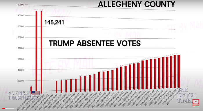
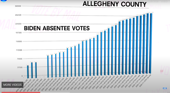
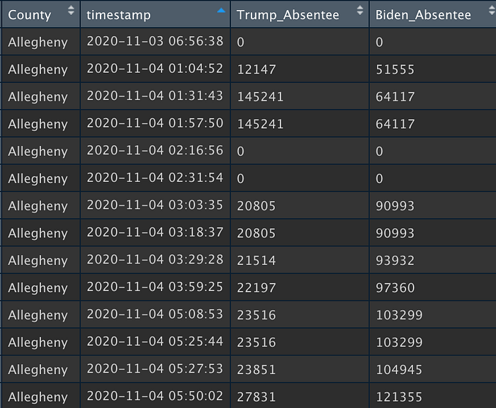
The timestamp and vote counts in the PA table I downloaded from Mealey’s links are identical to those shown in the charts above, making me confident they were the same tables used in the videos.
The huge, early spike in Trump absentee ballots for Allegheny Co. looks like an obvious data entry error, since it constitutes an addition of roughly 1/6th of ALL registered voters in Allegheny County being attributed to Trump in the span of a few minutes. However, the subsequent correction of this error, or “deletion of votes” is framed by the group as evidence of vote stealing. They acknowledge that Biden’s vote count also drops to zero here (likely while officials were fixing the error), but point out that his count quickly returns to its value before the spike, while Trump’s do not. This is true in this particular instance, though Biden’s vote total never spiked to such an unrealistic level as did Trump’s.
Now let’s look at other vote-types and counties across the state to see if such errors are indeed widespread and lopsided in Biden’s favor, as they repeatedly claim. Sticking with Allegheny County for a moment and taking one step back to look at absentee versus in-person vote counts:
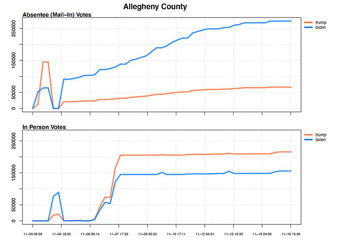
The upper graph shows the same absentee vote counts (as lines) seen in the videos’ bar charts, while the bottom shows the time-series of in-person votes. We can see that there were, in fact, strange spikes at roughly the same time for in-person votes as the absentee spike, suggesting a system-wide error at that point for both candidates’ vote types. Biden’s spike and subsequent “deletion” of in-person votes is much greater than Trump’s, but this is not mentioned in the video.
Looking to other counties, we can see that there are all sorts of errors and corrections that happen during the hectic vote tallying process, oftentimes seemingly favoring Trump. Take Lehigh County, which they show in the shorter video as a place where more votes were “stolen” from Trump:
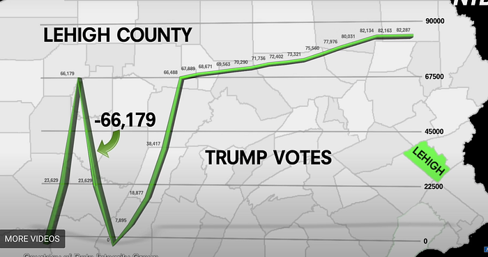
Their chart above shows a “shocking” 66,179 votes disappearing from Trump, which takes “three vote increments to recover”. Note the conspicuous absence of Biden’s vote total here. Let’s compare them:
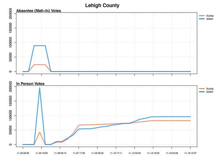
We see that again (and at about the same time as the Allegheny Co. errors) there were erroneous spikes in votes for both candidates and vote-types in Lehigh Co., though in this case the correcting them resulted in many more votes being “removed” from Biden, not Trump. In fact, the decline in total Biden votes (absentee & in-person) was 284,876, compared to Trump’s 66,179 during this error-and-correction period. But again, The Data Integrity Group chose not to show that in their video, instead selectively displaying data to paint a misconstrued narrative.
Vote counts in Chester County, PA, are also presented as damning evidence of votes stolen from Trump in the shorter video, where they again present (only) Trump’s absentee and in-person votes:
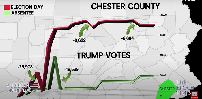
The full picture:

We can see that there’s all sorts of noise and instances of decrements in the time-series for both Trump and Biden in Chester Co.
Here’s an example of “vote switching” in Armstrong County, PA, which is clearly just a brief, mistaken switch of candidate labels associated the vote totals that is then quickly corrected:
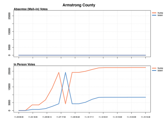
By their logic, some 20k votes were “removed” from both candidates here, with Biden never regaining his!
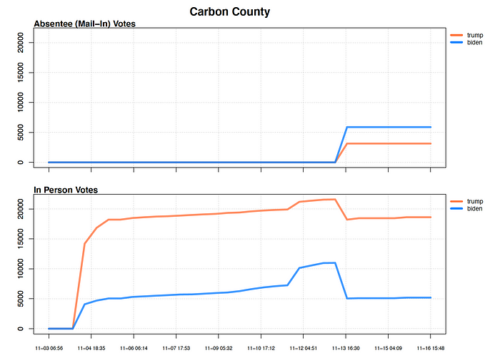
It’s also important to note that a lot of the observed decrements look to clearly be simply the product of labeling votes as absentee versus in-person. Carbon County, PA is a good example, where we clearly see that all votes are simply bundled as “in-person” to begin with, and then correctly partitioned as absentee or in-person at the end of the counting process.
The bottom line is that, unsurprisingly, collecting vote returns from over 9,000 voting districts across the state while people are working around the clock is bound to result in some mistakes (though some discrepancies, like the partitioning of absentee and in-person votes, likely aren’t even mistakes). The biggest mistakes are obvious and quickly corrected. Some smaller errors may fall through the cracks undetected, which is why statewide recounts usually alter final tallies slightly, though rarely by a substantial amount. The fact that the people in this video cite “37 errors” as being suggestive of a nefarious conspiracy is absurd, and in fact is an extremely small error rate given the number of human-driven data points involved (>9,000 voting districts multiplied by nearly 1,000 times updates were reported during the two-week counting period = ~9 million potential times at which an error could occur and accrue up to the county level).
There’s a good reason state election offices don’t release these raw time-series of vote counts in their final election results datasets, because they reflect all the errors and corrections that had to be made in real-time. If interpreted with selective, biased, data-ignorant logic, benign data blips can be cherry-picked and used as fodder by those looking for a reason to cry foul or cook up conspiracy theories.
Bearing this in mind, let’s now assess their flagship claim (and video title) of “over 432,000 votes removed from Trump in Pennsylvania Election”, with their definition of “vote removal” being any decline in cumulative vote tallies, which in a completely perfect world should only increase over time. They clearly explain this definition of ‘removal’ that undergirds their claims both verbally and graphically. Therefore, I wanted to make sure that I could arrive at the same value based on the data I obtained from them.
Summing the magnitudes of ALL decrements experienced by Trump’s absentee and in-person votes totals across the state yielded 431,219 (~432k) “removed”, or “stolen” votes. However, when you do this for Biden, you find that he actually had 960,655 votes “removed”, nearly double the number for Trump. So, based on their definition of potential “vote stealing”, you could use their own data and stated definition of vote removal to suggest that nearly twice the number of votes were taken from Biden! Again, it’s no surprise that they never present Biden’s numbers, and refer to them only in vague or abjectly false ways, like when McLaughin scornfully states that vote decrements or switching “nearly almost always favored Biden”, or Mealey stating “it occurs for Biden…but the degree is, you know we’re talking about ‘magnitude degree’ of votes” (implying Trump’s removals outstrip Biden’s by ‘orders of magnitude’).
Georgia
Let’s now quickly look at decrements or vote switching in Georgia, which is featured less heavily in the longer video compared to Pennsylvania. Specifically, McLaughlin cites an instance of “12,000 votes in Bibb County being switched from Trump to Biden”.
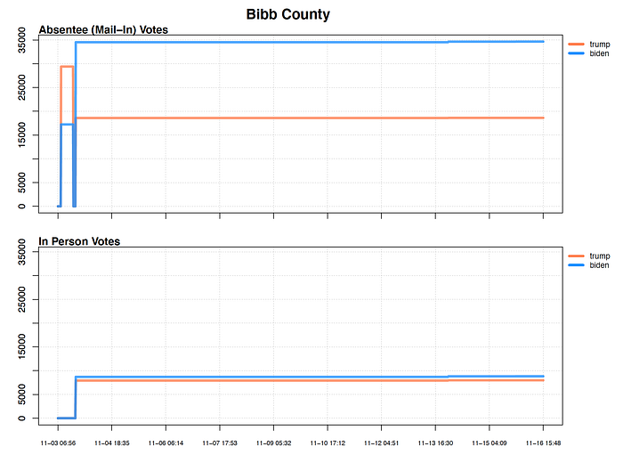
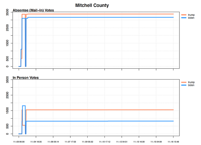
It’s true that early on it looks like Trump and Biden’s absentee vote totals are switched, though based on what we know about absentee vote patterns, one would expect Biden to have the advantage there, so Trump’s initial lead in that category seems like a potential error. Additionally, this is the only instance in all 159 Georgia counties in which such a switch happens in favor of Trump, and only one of two times it happens at all, the other favoring Biden in Mitchell County’s in-person vote tally.
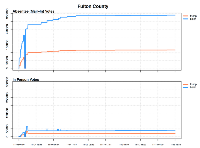
In general, the data they compiled for Georgia showed much less growth over time compared to PA, which suggests that counties likely tallied more votes internally before releasing them publicly. This is less true in more populous counties where vote counting took many more days, like in Fulton County (Atlanta).
There are still some instances of big vote decrements, with lots of counties showing a drop to zero at some point early on. And as I did for Pennsylvania, I summed up all the decrements in Georgia for each candidate to compare the total “removed” votes for each, and found that, based on their data and definition, Trump had 2,242,193 votes “removed” and Biden 2,114,277. So in this case, both candidates had over 2 million votes “removed”, with Trump’s total slightly higher than Biden’s. But again, it’s a meaningless value that doesn’t reflect any sort of “rigging”. For reference, the total number of votes cast in Georgia was 2,473,633 for Biden and 2,461,854 for Trump, which is essentially the same number of votes that were “removed” using their definition.
“Improbable distribution” of votes in voting precincts
There are a series of claims made in both videos that any voting district with a very high proportion of vote share for one candidate is somehow inherently suspicious. In the longer video, they show a screenshot of their remote testimony in front of the Georgia Secretary of State, where they have a slide that states “receiving 75% or more votes for one candidate in a precinct is abnormal”.
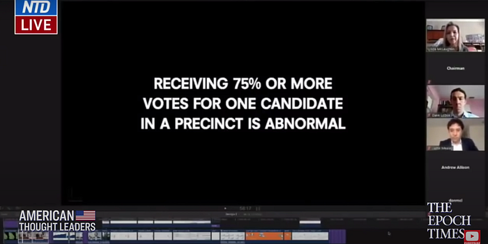
While it’s true that a candidate getting 75% of votes in a single precinct is less frequent than getting a smaller fraction, it’s by no means inherently suspicious . Voting precincts can consist of as little as a few dozen voters, and in dense, demographically-homogenous areas, the idea that voting behavior is highly uniform is not surprising at all.
But fine, let’s briefly entertain this idea of “abnormal” occurrences of vote share in precincts. Unfortunately, I couldn’t find precinct-level results for Georgia in Mealey’s data links, and the dataset he provides for Pennsylvania only consists of ~4,000 voting precincts, though according to the state’s website, there are over 9,100. Therefore, in the absence of complete data for PA, I only conducted precinct-level analysis for Georgia using raw data from the GA Secretary of State’s website that I compiled last month for a separate project on election results in the state.
Analyzing this precinct-level data in GA, I found that while Biden had 645 precincts where he notched vote shares of 75% or higher, Trump had nearly the same number at 618, showing no clear advantage for Biden in terms of “abnormal” precincts.
In the shorter Pennsylvania video, they attempt to convey suspicion about individual precinct (called ‘districts’ in PA) total by cherry-picking one district in Pittsburgh as proof of their theory:

But again, this is selective and disingenuous because of course there are going to be data points both above and below the average value across all districts in a county. That is, by definition, what an average represents. Showing a district-average across a county and then presenting a single district within that county whose value is above-average as a suggestion of fraud is nonsensical. If there weren’t any districts with values above 78%, then 78% wouldn’t be the average…
Adjudication of Ballots in Fulton County, GA
The last major claim in this video is regarding adjudicated ballots in Fulton County, Georgia (Atlanta) being done at a seemingly impossible rate. Mealey and Lobue state that their claim is based on a public statement that was given by a Fulton Co. election official on Nov. 4 (one day after the election) who claimed that out of 113,000 ballots cast, 106,000 had been adjudicated. Based on the fact that adjudicating a ballot typically occurs when the voting machine can’t read it, thereby necessitating a hand inspection to determine voter intent, they contend that it would be virtually impossible to physically adjudicate this many ballots in just one day’s time, insinuating that foul play must have occurred.
When I first watched this, the argument never made sense because only a very small fraction of ballots should be unreadable by machines and require a manual inspection. This only happens if a ballot is damaged, incorrect ink is used, a bubble isn’t filled-in, or there is a write-in candidate entered (they even mention some of these causes for adjudication in the video). It made no sense that these edge cases would constitute 94% of all ballots received in this Atlanta county.
Therefore, I did some digging and actually found the original clip of the election official that they were referencing. At 4m05s, the official clarifies what’s meant by “adjudication” in this context. Basically, their processing of absentee ballots consists of three steps: i) opening ballot and flattening, ii) running through voting machine, and iii) “adjudicating”. He states in the video that “so far we’ve gone through 113k ballots and 106k have been adjudicated and therefore published”, which implies that the remaining 7k had not yet been published at that time. He also states that votes are released in batches, and that the entire batch cannot be released until any ballots that need adjudicating are cleared.
Therefore, it’s clear from this video that the “adjudication” label he used there simply means the final certification for all votes. If a batch of, say, 1,000 votes has two ballots that require manual adjudication, that whole batch is held up while those two are inspected, after which the entire batch is deemed “adjudicated”. By this definition, they “adjudicate” 100% of all votes cast, which makes more sense than a claim that is premised on 94% of Fulton Co. residents submitting faulty ballots.
I suppose it’s possible Mealey and Lobue misinterpreted this election official’s public statement, but given how completely disingenuous and intentionally misleading they are with all of the other evidence presented throughout the video, I see no reason to believe that’s not the case here as well. More likely they are simply misconstruing another detail for the sake of supporting their false claim of systematic fraud.
Conclusions on Credibility of Claims
Upon inspecting The Data Integrity Group’s own dataset or contextualizing their other charges, I found no claims made in either video that bore any resemblance to the truth upon closer inspection. Perhaps if they had only accessed data for one or two counties and found some errors in Biden’s favor, I would say they should dig a little deeper and consider other counties’ values. However, given how repeatedly they rattle off statewide totals, and selectively present Biden numbers only when it’s advantageous to their narrative, it’s clear they looked at the full picture and filtered it to their liking. After all, my calculation of the 432k “removed votes” value for Trump in from their PA table simply entailed summing up a column that sat next to the analogous column for Biden, which yielded 960k removed votes when summed, an operation they too clearly would have done but chose not to report.
The simple fact is that this video was made by a group of people that intentionally selected a small, non-representative, subset of vote data in order to cast the false perception that systemic voting irregularities occurred in favor of Biden. Their claims are not only provably false using their own data, but actually demonstrate the opposite trend, that in fact Biden had roughly twice as many vote decrements as did Trump in Pennsylvania. Again, however, these decrements don’t reflect anything nefarious for either candidate, but rather the normal, imperfect process of tabulating tens of millions of votes.
Credibility of Video Publisher
This brings me to my final major point of investigation, which regards the overall credibility of the media publisher responsible for this video, The Epoch Times.
The YouTube channel “American Thought Leaders by The Epoch Times”, on which the longer video appears, looks to be a series of interviews by host Jan Jekielek with different guests. A quick survey of other videos on this channel reveals some pretty outlandish material. Here’s a video that claims the initial Chinese handling of COVID-19 was done ‘deliberately’ to allow it to spread around the world and then to impact the US election the following year (specifically causing more ‘fraudulent’ mail-in ballots to be used). Not only is the idea that China would unleash a deadly virus on one of its own major population centers in the hopes that it makes it to the US and then festers for eleven months until the election a wildly unlikely claim, but it’s also impossible to prove, my point being that American Thought Leaders is not averse to platforming people with lofty, impossible-to-prove, conspiratorial claims.
The Epoch Times as a whole is a very strange news organization that has become very popular in recent years among rightwing circles. It was actually founded as an anti-Chinese Communist Party publication by members of the “Falun Gong” new religious movement in China. It seems to roughly espouse tenets of Zen Buddhism, but also has many unique beliefs about spirits and divinity, and criticizes many aspects of modern science, including the theory of evolution. During a speech at The Epoch Times’ US office in Manhattan, one of the leaders of Falun Gong, Li Hongzhi, spells out his vision for the publication and its divine imperative. Some of Li’s other viewpoints apparently include claiming that he can levitate, fly through walls, and that ‘aliens from undiscovered dimensions have invaded the minds and bodies of humans, bringing corruption and inventions such as computers and airplanes.’ All of this said, I don’t have any specific problems with Falun Gong or its followers, though distrust in science is discouraging; I just don’t think their newspapers are necessarily the most qualified arbiters of national election results, nor should they be viewed as such.
Conclusions
We live in a pretty terrible age of (mis)information, with so much media content across the political spectrum having no factual basis. Outlets that exist on the fringe are even less trustworthy, as they are subject to less public scrutiny, which affords them with more latitude to bend truths and cater to the fears or anxieties held by specific subsets of people. When I last checked, the Epoch Times video had almost 380k views and the shorter video over 750k, with thousands of comments by people incensed about election theft, calling for officials to be jailed or worse. I can’t help but wonder how many people watched this video and then decided to buy a plane ticket to help storm the Capitol on January 6. Or how many people gained a newfound sense of allegiance, respect, or membership with extremist groups whose senses of purpose are founded on lies like these.
As consumers of information in the modern internet-age, we must take much of what we see or read with a grain of salt, sift through multiple, reputable sources in search of the most likely truth, and ultimately to allow ourselves to accept that truth, even if we wish for an alternate falsehood. Reining in our imaginations amidst a media marketplace increasingly designed to exploit and encourage distrust isn’t easy, but it’s something we have to practice while holding those that peddle lies to account.
Data Access
The county-level data tables for Georgia and Pennsylvania I downloaded from The Data Integrity Group can be found along with the R script I used to analyze them on GitHub here. Also included are PDFs of the vote tally graphs for every counties in the two states.
